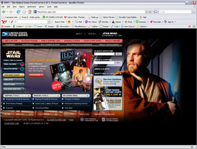
This is amazing to see:

Visit usps.gov – Enlarge image
When I started working on online ads, it was acknowledged that c|net.com was one of the most innovative in online advertising. Then came the portals, and pushed by all the advertising technology companies like Eyeblaster.com and Pointroll.com. We’d all be doing floating ads and site takeovers, popups and popunders, expanding ads, video ads and wondering what our users were thinking about all these things flying around on their pages.
However, it was only those companies that were innovative and daring enough, and desperate enough for revenue, that would try these ideas. Some worked, some didn’t. But pretty much everything generated revenue. Some of the older institutions would never try these ideas. They worried about annoying users or creating experiences that would degrade trust of their users. For the most part, they were right. But sometimes we found they were wrong.
It’s hard to predict what users think. The world keeps changing and users’ preferences and tolerances change as the internet presents experiences that, in the beginning, are unique and potentially shocking, but then over time become commonplace.
What does this say about the internet when a venerable organization such as the United States Post Office joins the online advertising revolution-now-become-commonplace and places a site takeover on their top page?
Site Takeover of USPS.GOV!
1 Reply